
For the many businesses that use Microsoft 365 productivity apps, one of the most used apps is Microsoft Excel. If you’re like me and work in complex workbooks with multiple sheets, then you know that Excel is crucial for organizing and presenting business data. During the 2020 global pandemic, Microsoft added better sharing of Excel spreadsheets in Microsoft Teams and sped up support for real-time data from the cloud to ensure that users get fantastic performance no matter where they work. Whether you need to deploy a data visualization template in Excel to enhance your business intelligence or a full suite of remote working tools to enhance productivity. At the intersection of location and performance, is Excel’s ability to turn location-related data (e.g. street addresses, countries, etc.) into dynamic cloud-powered maps out of your spreadsheets using a feature called Map Charts.
Data visualization made (sort of) easy?
Originally offered as a “Bing Maps” add-in for Excel 2013, the Map Charts feature in Excel for Microsoft 365 reads columns with geographic locations in your spreadsheet and automatically turning them into color-coded maps. Geographic heat maps are a popular because they can be used to express data related to weather, economics, healthcare, and more. This feature is an excellent way to map the concentration of resources in a specific geographic location—often called a heat map. Say you had an Excel spreadsheet that listed the number of barbeque restaurants per capita located in Dallas, Texas based on ZIP codes. Without any visual context, this spreadsheet is just a list of numbers. Visualizing this boring list of numbers will help present the data to a wider audience. But unless you are a postal worker that lives in the area, you likely do not know where in the city each of those ZIP codes are located. Using the Insert Map Chart button in Excel leverages the power of the cloud to draw a map based on the numbers in your spreadsheet combined with the most current online data from Microsoft to create a color-coded breakdown of the restaurant data onto that map:
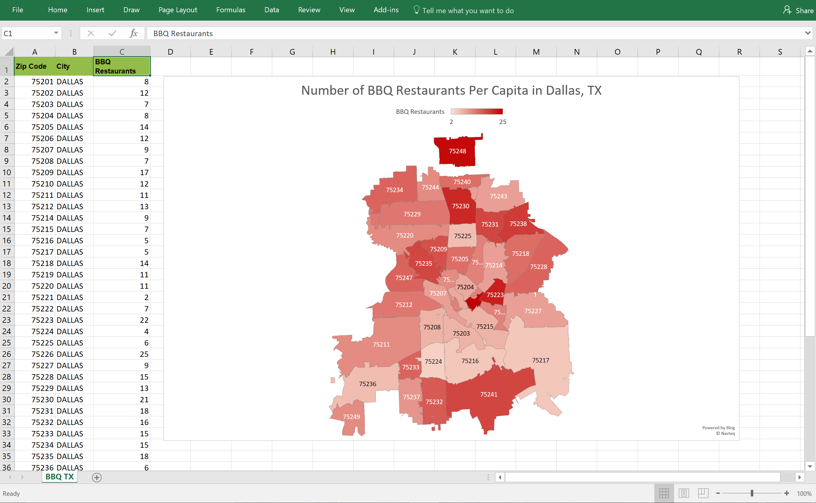
Using this feature in Excel provides business users with a way to create heat maps for their geographic data. However, the downside is that geographic visualization—depending on your dataset—feels a little basic. While you can draw maps to be worldwide down to citywide and change the colors to match your business’ branding guidelines, the problem many Excel users run into is those map chart configuration options are not easy to find. Even for those of us who personally “live in Excel” and make complex pivot tables daily, configuring the map chart can be a challenge. I’ll admit that just configuring the BBQ restaurants per capita heat map in my example required some patience to show the citywide view rather than the default statewide view.
Excel map templates to the rescue
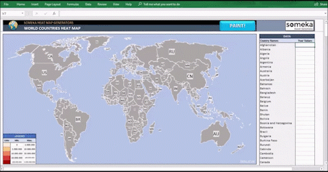
Amaxra consultants who create heat maps use the Someka heat map generator template for Excel. The template is available for multiple geographies and has a wide range of customization options. Although the map customization options are very granular when it comes to the color palette, display text, and map sizing, Amaxra consultants are never overwhelmed by the choices. To help guide novices, the template has onscreen instructions that can be toggled on or off as users get more familiar with the map generator.
Exporting the heat map from Excel is a simple copy-and-paste into other Microsoft 365 productivity apps such as PowerPoint, and the map you paste into a PowerPoint slide will automatically update if you change any of the values in the Excel spreadsheet from which you copied. While the copy-paste option is great for easy editing and sharing inside your organization, the template also enables you to export the heat map as a static Adobe PDF to share outside your organization.
Amaxra helps your business be more productive
As early adopters of Microsoft 365, Amaxra consultants have years of experience with proven productivity apps such as Microsoft Excel and PowerPoint along with the latest cloud-native remote collaboration solutions such as Microsoft Teams. Whether you need to deploy a data visualization template in Excel to enhance your business intelligence or a full suite of remote working tools to enhance productivity, Amaxra has the expertise you need to empower your employees to do their best work. We are happy to provide direct support to our existing/current customers and welcome comments. If you would like to know more the services Amaxra provides please contact technology@amaxra.com.
Blog last updated – 12/30/2020